MDM565 Week 3
Annotated
Bibliography
-
Adams, S. (2019, October 1). Graphic design foundations: Ideas, concepts, and form [Video series]. LinkedIn Learning. https://www.linkedin.com/learning/graphic-design-foundations-ideas-concepts-and-form/ideas-concepts-and-form-in-graphic-design?resume=false&u=50813145
The video series "Graphic Design Foundations: Ideas, Concepts, and Form" explores the genesis of design ideas, focusing on metaphors, humor, typography, iconography, imagery, and more. Sean Adams provides practical techniques and inspiration to create visually compelling designs communicating messages effectively. This video series is a reliable source, authored by Sean Adams, a recognized expert in graphic design. The content is objective, based on well-established design principles, and is current, making it a credible and valuable resource for understanding the foundational concepts of graphic design. This video series complements other sources in the annotated bibliography by offering in-depth insights into the creative process of graphic design. It deepens the understanding of "how to use" metaphors, humor, typography, and imagery to enhance communication in design projects. The techniques learned from this series create more engaging and effective designs.
-
Adobe. (2023, September 8). Graphic design basics: The principles of design. Retrieved from https://www.adobe.com/learn/express/web/graphic-design-basics?locale=en&learnIn=1
This article provides an overview of the fundamental principles of design, including alignment, hierarchy, balance, contrast, repetition, and proximity. It explains how these principles can be applied to create visually appealing and effective designs. The source is objective and reliable, offering well-researched content from a reputable design platform. Adobe is a trusted name in the design industry, ensuring the credibility and current relevance of the information. This article complements other sources in the bibliography by focusing on practical design principles. It deepens the understanding of "how to create" engaging and effective designs, which will be valuable for research on visual communication. The insights gained from this source will help analyze and apply design principles in work.
-
Argo, B. (2023). Week 3 lecture - Visual communication components. Full Sail Online. Retrieved from https://online.fullsail.edu/class_sections/222076/modules/811880/activities/4662609
The lecture "Visual Communication Components" by Bartley Argo discusses the importance of text, imagery, and stylization in media design. Argo explains how each component communicates in its own way but is most effective when used together. The lecture delves into the distinctions between text and typography, the power of imagery to convey subtext and mood, and the role of stylization in emphasizing mood and affecting the energy of a piece. This lecture is a reliable source, authored by Mr. Bartley Argo, a well-respected visual communication and design expert. The content is objective and based on well-established design principles. Argo's credibility is evident through his thorough and structured presentation of visual communication concepts, making the lecture a valuable resource for understanding the interplay of text, imagery, and stylization in design. This lecture complements other sources in the annotated bibliography by providing a comprehensive framework for leveraging text, imagery, and stylization in media design. It has deepened the understanding of how these components communicate messages quickly and clearly. The insights gained from this lecture create more effective and engaging design projects, ensuring they convey the intended message with clarity and impact.
-
Canva. (n.d.). How to combine text and images to improve visual design and communication. Retrieved from https://www.canva.com/learn/How-to-combine-text-and-images-to-improve-visual-design-and-communication/
This article provides practical tips and techniques for effectively combining text and images in media design. It emphasizes the importance of composition, readability, and the balance between text and visual elements to create visually appealing and communicative designs. The source is objective and reliable, offering well-researched content from a reputable design platform. Canva is known for its expertise in graphic design, making the information trustworthy and current. This article complements other sources in the bibliography by focusing on the practical application of design principles. It broadens the understanding of "how to create" engaging and effective designs by combining text and images. This information is valuable for research on visual communication and design techniques.
-
Interaction Design Foundation. (n.d.). The building blocks of visual design. Retrieved from https://www.interaction-design.org/literature/article/the-building-blocks-of-visual-design
This article provides an in-depth exploration of the fundamental elements of visual design, including line, shape, color, texture, space, form, and value. It explains how these elements are the building blocks of any visual composition and "how they" interact to create a cohesive and aesthetically pleasing design. The source is objective and reliable, offering well-researched content from a reputable design education platform. The Interaction Design Foundation is known for its expertise in design principles, making the information trustworthy and current. This article complements other sources in the bibliography by providing a comprehensive overview of visual design elements. It deepens the understanding of how these elements contribute to effective design and will be instrumental in research on visual communication. The insights gained from this source will help analyze and apply design principles in design work.
-
Keung, L. (2024, September 4). The principles of design. Retrieved from https://design.tutsplus.com/articles/the-principles-of-design--cms-33962
This article provides a comprehensive overview of the fundamental principles of design, including balance, contrast, emphasis, movement, pattern, rhythm, and unity. It explains how these principles can be applied to create visually appealing and effective designs. The source is objective and reliable, offering well-researched content from a reputable design education platform. Tuts+ is known for its expertise in design tutorials, making the information trustworthy and current. This article complements other sources in the bibliography by focusing on practical design principles. It deepens the understanding of "how to create" engaging and effective designs, which will be valuable for research on visual communication. The insights gained from this source will help when analyzing and applying design principles.
-
White, J. (1995). Art, Design, and Visual Thinking. Retrieved from http://char.txa.cornell.edu/language/
This comprehensive resource covers fundamental elements and principles of design, including point and line, form, shape, space, movement, color, pattern, texture, balance, proportion, rhythm, emphasis, and unity. Each chapter delves into how these elements and principles interact to create visually engaging and meaningful compositions. The text provides detailed explanations and examples to illustrate key concepts, making it a valuable resource for understanding the foundations of design. The source is objective and well-researched, with current and credible content. The author's expertise in design is evident, ensuring the reliability of the information presented. The website is a trusted educational resource, making it a dependable reference for design principles. This consolidated source serves as a comprehensive guide to the essential elements and principles of design. It has enhanced the understanding of how different components work together to create compelling visual compositions. This resource is instrumental in researching visual hierarchy and applying design principles in various media. It provides a solid foundation for analyzing and applying design concepts, helping bridge the gap between theory and practice.
-
Suhad M. (2016, September 22). The difference between design and art. UX Planet. https://uxplanet.org/the-difference-between-design-and-art-d9b293360ed2
In "The Difference Between Design and Art," M. Suhad explores the distinctions between design and art, emphasizing that design is driven by functionality and solving problems, while art is more about personal expression and creativity. The article discusses how designers use objective decisions based on research and best practices, whereas artists may rely more on subjective choices. It highlights the importance of balancing objectivity and subjectivity in design to achieve functionality and aesthetic appeal. This article is a reliable source, authored by M. Suhad, a professional in the design industry. The content is objective, presenting well-researched information and practical insights into design principles. M. Suhad's credibility is established through her experience and contributions to the field, making the article a valuable resource for understanding the balance between objectivity and subjectivity in design. This article complements other sources in the annotated bibliography by clearly distinguishing between design and art and the role of objectivity and subjectivity in design decisions. It deepens the understanding of how to make informed design choices that are both functional and visually appealing. The insights gained from this article enhance design projects, ensuring they effectively communicate the intended message while maintaining aesthetic quality.
Graduate Writing
combining text
& images
The video series by Sean Adams delves into the effective combination of text and images in design. Adams emphasizes the importance of integrating typography and imagery to create visually compelling and communicative designs. He provides practical techniques, using metaphors and humor to enhance the impact of text-image combinations. The objective, well-researched content from a recognized expert makes this source reliable. The insights gained complement other sources by deepening the understanding of creating engaging and effective designs through the harmonious integration of text and images, essential for visual communication.
The article from Canva emphasizes the significance of effectively combining text and images to enhance visual design and communication. It highlights the importance of composition, readability, and balance between text and visual elements. The source provides practical tips for creating visually appealing designs and communicating messages clearly. Canva's expertise in graphic design ensures the reliability of the content. This article broadens the understanding of "how to create" engaging designs by integrating text and images, making it a valuable resource for research on visual communication and design techniques. The practical application of design principles is a key focus.

The "Masters of Flight" image on Dribbble exemplifies the concepts Sean Adams and Canva discussed. It showcases the effective combination of text and images to create a visually compelling design. The typography is integrated seamlessly with the imagery, enhancing communication and visual appeal. The composition, readability, and balance between text and visual elements are well-executed, demonstrating the practical application of design principles. Using metaphors and visual harmony aligns with Adams' techniques, while Canva's emphasis on clear communication and design techniques is evident. This image effectively conveys the importance of text-image integration in media design.
The elements of
visual design
The Interaction Design Foundation article emphasizes the fundamental elements of visual design—line, shape, color, texture, space, form, and value—highlighting their critical role in media design. By exploring how these elements interact to create cohesive and aesthetically pleasing compositions, the article provides a comprehensive understanding of the building blocks of visual design. The source is reliable, well-researched, and objective, making it a trustworthy reference. The insights gained from this article enhance the understanding of how to effectively apply these elements in media design, contributing to more engaging and visually compelling designs.
The source by White (1995) extensively examines the fundamental elements of visual design—such as point, line, form, shape, space, movement, color, pattern, and texture—and their application in media design. It clarifies how these elements interact to create visually engaging and meaningful compositions. The objective, well-researched content ensures the reliability of the information. The insights from this source are invaluable for understanding how to apply these design elements effectively in media projects, contributing to more cohesive and aesthetically pleasing designs. This foundation is essential for bridging theory and practice in visual communication.

The image demonstrates the effective use of visual design elements such as line, shape, color, texture, space, form, and value. The lines and shapes create a structured composition, while color adds vibrancy and contrast. The texture and value elements add depth and dimension to the design. The interplay of these elements creates a cohesive and aesthetically pleasing composition, aligning with the principles discussed in the Interaction Design Foundation article and White (1995). This image highlights the critical role of these elements in creating engaging and visually compelling media designs, effectively bridging theory and practice.
The principles
of design
The Principles of Design Adobe article highlights essential design principles such as alignment, hierarchy, balance, contrast, repetition, and proximity, emphasizing their application in creating visually appealing designs. As a trusted authority in design, Adobe provides objective and reliable insights, ensuring the relevance of the content. The article enhances the understanding of "how to apply" these principles effectively, making it a valuable resource for visual communication research. This source complements other resources by focusing on practical design principles and helps analyze and create engaging designs, bridging the gap between theoretical concepts and practical application.
Keung's (2024) article highlights essential design principles such as balance, contrast, emphasis, movement, pattern, rhythm, and unity, emphasizing their application in creating visually appealing designs. The source is objective, reliable, and well-researched, ensuring the information is trustworthy and current. Tuts+'s expertise in design tutorials adds credibility. This article complements other sources by providing practical insights into applying design principles and deepening the understanding of creating engaging and effective designs. The insights gained are invaluable for research on visual communication, aiding in analyzing and applying design principles in various projects.

The image effectively demonstrates some of the principles of design discussed in the Adobe and Keung articles. It showcases alignment, hierarchy, balance, contrast, repetition, and proximity, creating a visually appealing and coherent composition. The balance and contrast enhance the visual impact, while the movement and rhythm guide the viewer's eye. The pattern and unity ensure cohesiveness. These principles are applied practically, emphasizing their importance in creating engaging and effective designs. The image serves as a practical example of "how to integrate" these principles to enhance visual communication, reflecting the insights provided by the sources.
-
Adams, S. (2019, October 1). Graphic design foundations: Ideas, concepts, and form [Video series]. LinkedIn Learning. https://www.linkedin.com/learning/graphic-design-foundations-ideas-concepts-and-form/ideas-concepts-and-form-in-graphic-design?resume=false&u=50813145
Adobe. (2023, September 8). Graphic design basics: The principles of design. Retrieved from https://www.adobe.com/learn/express/web/graphic-design-basics?locale=en&learnIn=1
Argo, B. (2023). Week 3 lecture - Visual communication components. Full Sail Online. Retrieved from https://online.fullsail.edu/class_sections/222076/modules/811880/activities/4662609
Canva. (n.d.). How to combine text and images to improve visual design and communication. Retrieved from https://www.canva.com/learn/How-to-combine-text-and-images-to-improve-visual-design-and-communication/
GeeksforGeeks. (2023). Visual Elements. Retrieved from https://media.geeksforgeeks.org/wp-content/uploads/20231208135646/Visual-Elements.webp
Interaction Design Foundation. (n.d.). The building blocks of visual design. Retrieved from https://www.interaction-design.org/literature/article/the-building-blocks-of-visual-design
Keung, L. (2024, September 4). The principles of design. Retrieved from https://design.tutsplus.com/articles/the-principles-of-design--cms-33962
Siljak, V. (2015). Masters of flight. Retrieved from https://dribbble.com/shots/2352765-Masters-of-Flight
Unknown Author. (n.d.). The principles of design. Retrieved from https://i.pinimg.com/originals/2d/b6/c6/2db6c6d647af90d38e628a05435580a2.png
White, J. (1995). Art, Design, and Visual Thinking. Retrieved from http://char.txa.cornell.edu/language/
3.6 Design Challenge:
Design with Type,
Color, & Images
The Challenge
This exercise was all about combining what we did on Week 1 with Week 2 — we were asked to combine typography with images, color, and forms to create outdoor display banners that promote the three events/holidays that we’ve been working with this month.
If you remember from the previous two weeks, we were given the following list:
New Year's Day | Valentine's Day | St. Patrick's Day | Earth Day | Easter | Juneteenth | Halloween | Dia de los Muertos | Thanksgiving | Kwanzaa | Hanukkah | Christmas
The three holidays that I picked are in BOLD RED text. In PhotoShop, we created designs that were intended to go on two adjacent banners with a pole in the middle.
Deliverables were three images, one for each holiday.
NOTE: I created a file that included the space that the POLE occupied. I then created a SLUG (white rectangle) layer that represented the space between the two banners. Next I created my image as one big image with guidelines set against either side of the now-hidden SLUG layer. By doing this, I had an accurate placement of all content, so when it was placed on the two separate banners and lines or shapes went from one banner to the other, the placement was accurate across the two banners even though the single image had a large strip missing from the image and pole separating the two banners.
Dia de los Muertos

The complete image without the missing strip down the center.

The image as it would appear across two separated banners.
Halloween
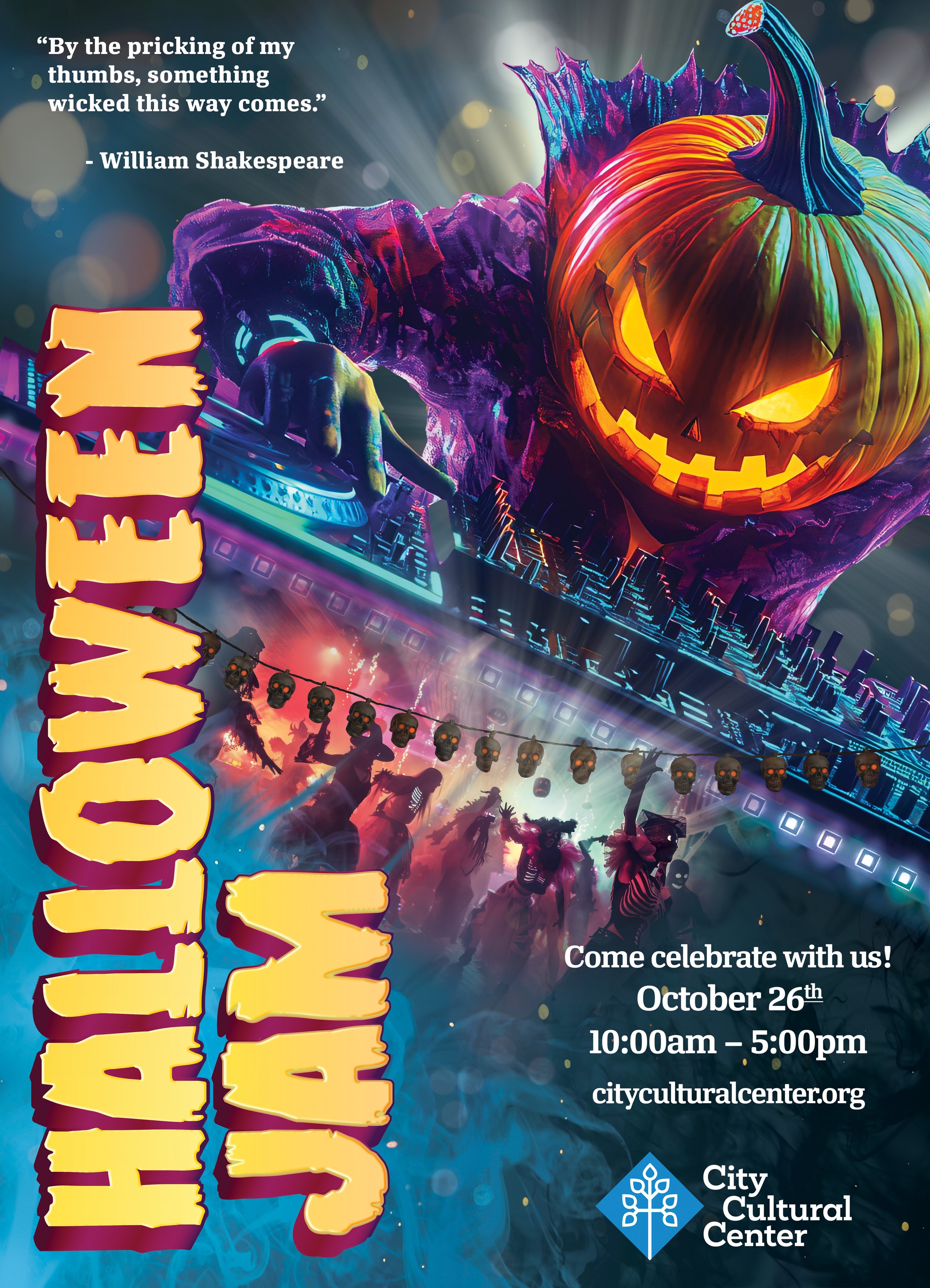
The complete image without the missing strip down the center.

The image as it would appear across two separated banners.
Valentine’s Day

The complete image without the missing strip down the center.

The image as it would appear across two separated banners.
My observations
This was an exciting project. The idea was to communicate the holiday that is represented using text and imagery. I think I did a good job nailing the tone of each holiday and representing specific events. I felt that I hit the mark on all three holidays, but Dia de los Muertos was by far the best design.