MDM565 Week 2
Annotated
Bibliography
-
Argo, B. (2023). Part 1: Design Reasoning. (2023). Full Sail Online. Retrieved from https://online.fullsail.edu/class_sections/222076/modules/811879/activities/4662602
The lecture "Design Reasoning" explores the distinct difference between art and design, emphasizing the responsibility of the designer to communicate a specific message to a target audience. It highlights that every aspect of a media asset is a deliberate design choice, from fonts and colors to layout and imagery. The lecture delves into three primary criteria for design decisions: Product-Based Reasoning, Consumer-Based Reasoning, and Effect-Based Reasoning, each focusing on different aspects of design decision-making to ensure effective communication. The lecture presents a thorough and structured approach to understanding design principles, making it a reliable source of information. The content is objective and based on well-established design theories and practices. The author's credibility is evident through the detailed and methodical presentation of design concepts, reflecting a deep understanding of the subject matter. This lecture is a valuable addition to my research on design principles and effective communication through visual elements. It complements other sources in the annotated bibliography by providing a practical framework for making design decisions. The information has reinforced the understanding of the purposeful nature of design and the importance of considering the target audience. This lecture enhances design projects by applying the criteria for design reasoning to achieve clearer and more impactful communication.
-
Argo, B. (2023). Part 2: Typographic Refinement. (2023). Full Sail Online. Retrieved from https://online.fullsail.edu/class_sections/222076/modules/811879/activities/4662602
The lecture "Typographic Refinement" delves into the importance of proper text-handling practices in media design, emphasizing how spacing, alignment, and margins contribute to a professional and practical design. It explains concepts such as kerning, tracking, leading, justification, grids, columns, and margins, highlighting their roles in achieving clear and professional communication. The lecture underscores that refined typography reflects a designer's attention to detail and skill. This lecture is a reliable source of information on typographic refinement, offering practical insights and guidelines grounded in centuries of typographic practice. The content is objective and well-supported by design principles, making it a credible and valuable resource for designers seeking to enhance their typography skills. This lecture complements other sources in the annotated bibliography by focusing on typography, which is crucial for effective design communication. It reinforces the importance of spacing, alignment, and margins and inspires one to pay closer attention to these elements in design projects. The information ensures that the typography in future projects is professional and engaging.
-
Butler, J. (2014, November 3). The 33 laws of typography [Video]. LinkedIn Learning. https://www.linkedin.com/learning/the-33-laws-of-typography/introduction?resume=false&u=50813145
"The 33 Laws of Typography" by Jill Butler is a comprehensive video series that distills her extensive experience in teaching and design consulting into 33 essential principles of typography. These laws cover various aspects of typography, including documents, large bodies of text, small blocks of text, punctuation, and typefaces. Butler provides practical advice on applying these principles to create more substantial and visually appealing compositions. This video series is a reliable source, authored by Jill Butler, a well-respected expert in typography. The content is objective, focusing on established design principles and techniques. Butler's credibility is evident through her years of experience and contributions to the field, making the series a valuable resource for designers. This video series complements other sources in this annotated bibliography by offering detailed insights into typography principles. It deepens the understanding of how to enhance the readability and visual impact of the designs. The techniques learned from this series will improve all design projects, ensuring they communicate messages effectively and attractively.
-
Design Reasoning In Action Case Study. (2024). Full Sail Online. Retrieved from https://online.fullsail.edu/class_sections/222076/modules/811879/activities/4662604
The case study "Design Reasoning in Action" examines how design decisions shape communication by presenting three different movie posters for a film titled "Blind," each tailored to a different genre: Documentary, Romantic Comedy, and Science Fiction. The designer, Melissa Gridley, used genre-specific design choices to convey distinct aspects of each movie, demonstrating how design can communicate the film's story and engage its target audience. Full Sail University is a reliable source, presenting well-reasoned design choices that illustrate the application of design reasoning in practical scenarios. The content is objective and based on established design principles, making it a credible resource for understanding how design decisions can effectively communicate different aspects of a story. This case study complements other sources in the annotated bibliography by providing concrete examples of design reasoning in action. It has enhanced the understanding of how to tailor design choices to different genres and target audiences. The insights gained from this case study inform design projects, ensuring that design decisions effectively communicate the intended message to the target audience.
-
Interaction Design Foundation. (n.d.). Visual hierarchy. Interaction Design Foundation. https://www.interaction-design.org/literature/topics/visual-hierarchy
The article "Visual Hierarchy" from the Interaction Design Foundation explores the principles and importance of visual hierarchy in design. It explains how visual hierarchy guides the viewer's eye to the most important elements first and provides techniques for creating effective hierarchy through contrast, size, alignment, and spacing. The article emphasizes the role of visual hierarchy in enhancing user experience and ensuring that the design communicates its message clearly and efficiently. This article is a reliable source authored by the Interaction Design Foundation, a reputable organization in the field of UX design. The content is objective and based on well-established design principles, making it a credible and valuable resource for understanding visual hierarchy. Its extensive contributions to design education and research reinforce the organization's credibility. This article complements other sources in the annotated bibliography by focusing on visual hierarchy, a crucial aspect of effective design communication. It deepens the understanding of using contrast, size, alignment, and spacing to create a clear visual hierarchy. The techniques learned from this article improve the organization and clarity of design projects, ensuring that they effectively guide the viewer's attention to the most important elements.
-
Saltz, I. (2013, November 25). Typography: Hierarchy and Navigation [Video]. LinkedIn Learning. https://www.linkedin.com/learning/typography-hierarchy-and-navigation/welcome?u=50813145
In the video series "Typography: Hierarchy and Navigation," Ina Saltz explores the concepts of hierarchy and navigation in typography. She provides techniques for creating clear levels of importance and guiding readers effectively, whether in print-based or screen-based communication design. The series is designed for designers with a foundational understanding of typography, aiming to enhance their skills in creating visually organized and navigable content. This video series is a reliable source, authored by Ina Saltz, a recognized expert in typography. The content is objective, focusing on practical design principles and techniques. Saltz's credibility is established through her extensive experience and previous works in the field of typography, making the series a valuable resource for designers. This video series complements other sources in the annotated bibliography by providing in-depth insights into typography hierarchy and navigation. It deepens understanding of creating clear visual hierarchies and improving navigation in design projects. The techniques learned from this series will enhance the readability and effectiveness of future designs, ensuring that they communicate messages clearly and efficiently.
-
Selis, K. (2022, March 24). Design vs. art: Objectivity & subjectivity. 116 & West. https://116andwest.com/strategic-insights/design-vs-art-objectivity-subjectivity/
The article "Design vs. Art: Objectivity & Subjectivity" explores the differences between design and art, emphasizing that design is driven by a purpose to solve problems, while art is more about personal expression. It discusses how designers use objective decisions based on data, research, and best practices, whereas artists may rely more on subjective choices. The article highlights the importance of balancing objectivity and subjectivity in design to achieve functionality and aesthetic appeal. This article is a reliable source, authored by Kelsey Selis, a professional in the design industry. The content is objective, presenting well-researched information and practical insights into design principles. Selis's credibility is established through her experience and contributions to the field, making the article a valuable resource for understanding the balance between objectivity and subjectivity in design. This article complements other sources in the annotated bibliography by clearly distinguishing between design and art and the role of objectivity and subjectivity in design decisions. It has deepened the understanding of how to make informed design choices that are both functional and visually appealing. The insights gained from this article enhance design projects, ensuring they effectively communicate the intended message while maintaining aesthetic quality.
-
Suhad M. (2016, September 22). The difference between design and art. UX Planet. https://uxplanet.org/the-difference-between-design-and-art-d9b293360ed2
In "The Difference Between Design and Art," M. Suhad explores the distinctions between design and art, emphasizing that design is driven by functionality and solving problems, while art is more about personal expression and creativity. The article discusses how designers use objective decisions based on research and best practices, whereas artists may rely more on subjective choices. It highlights the importance of balancing objectivity and subjectivity in design to achieve functionality and aesthetic appeal. This article is a reliable source, authored by M. Suhad, a professional in the design industry. The content is objective, presenting well-researched information and practical insights into design principles. M. Suhad's credibility is established through her experience and contributions to the field, making the article a valuable resource for understanding the balance between objectivity and subjectivity in design. This article complements other sources in the annotated bibliography by clearly distinguishing between design and art and the role of objectivity and subjectivity in design decisions. It deepens the understanding of how to make informed design choices that are both functional and visually appealing. The insights gained from this article enhance design projects, ensuring they effectively communicate the intended message while maintaining aesthetic quality.
Graduate Writing
Art vs. Design
According to M. Suhad in "The Difference Between Design and Art," design focuses on functionality and problem-solving, while art prioritizes personal expression and creativity. Designers rely on objective decisions informed by research and best practices, contrasting with artists' subjective choices. The article stresses the need to balance objectivity and subjectivity in design to achieve functionality and aesthetic appeal. This perspective highlights the practical, user-centered nature of design compared to the more individualistic approach of art, underscoring the importance of purposeful design choices to communicate messages effectively.
Kelsey Selis's article "Design vs. Art: Objectivity & Subjectivity" emphasizes that design aims to solve problems with purpose and functionality, using objective decisions based on data and best practices. In contrast, art focuses on personal expression and creativity, often relying on subjective choices. Selis highlights the necessity of balancing objectivity and subjectivity in design to achieve functionality and aesthetic appeal. This perspective underscores design's practical, problem-solving nature, distinguishing it from art's more individualistic approach, and stresses the importance of informed, purposeful design choices for effective communication.

The Art vs. Design Infographic image visually demonstrates the concepts discussed by M. Suhad and Kelsey Selis. It contrasts art, driven by personal expression and subjective choices, with design, which focuses on functionality and problem-solving through objective decisions based on research and best practices. The image highlights how design aims to communicate effectively and serve a specific purpose, while art prioritizes individual creativity and aesthetic appeal. This visually reinforces the need for a balance between objectivity and subjectivity in design to achieve functionality and aesthetic quality, as both authors emphasize
Design Decision
In "The 33 Laws of Typography," Jill Butler emphasizes that established principles and best practices should guide media design decisions. Butler provides practical advice on typography, focusing on readability, visual impact, and effective communication. She highlights the importance of applying objective design principles, such as proper font selection, spacing, and alignment, to create visually appealing and functional compositions. This perspective underscores that design decisions in media design must balance aesthetics and functionality, ensuring that the final product effectively conveys the intended message while maintaining a professional appearance.
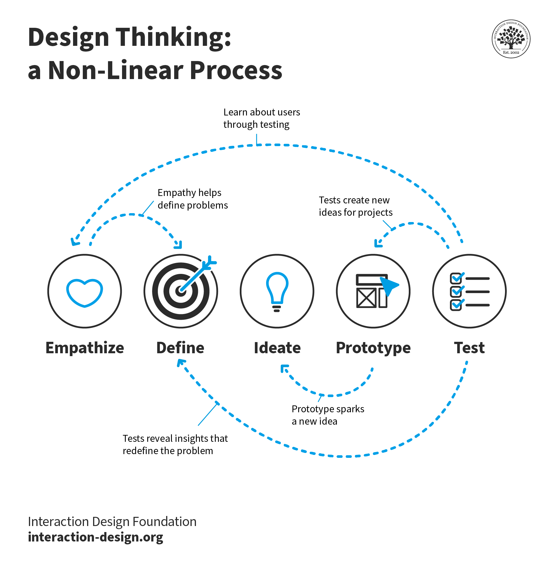
According to Professor Argo's lecture "Design Reasoning," design decisions in media design are deliberate choices aimed at effective communication with a target audience. The lecture emphasizes three criteria for making these decisions: Product-Based Reasoning, Consumer-Based Reasoning, and Effect-Based Reasoning. Each aspect ensures that the design aligns with the product's identity, caters to the audience's preferences, and enhances clarity. This structured approach highlights the importance of purposeful design, balancing aesthetic appeal with functionality to achieve impactful communication. Argo's insights reinforce the need for a methodical framework in design decision-making to create clear, engaging, and meaningful media assets.

The image "Design Thinking Non-Linear Process" demonstrates the use of design decisions by highlighting the iterative and non-linear nature of the design process. It aligns with Jill Butler's emphasis on balancing aesthetics and functionality through established principles and Professor Argo's structured approach of product-based, consumer-based, and effect-based reasoning. The visual represents how designers make deliberate choices to address user needs, enhance clarity, and ensure effective communication, reflecting the purposeful nature of design decisions. This reinforces the importance of a methodical framework for creating clear, engaging, and impactful media assets.
Types of
visual heirarchY
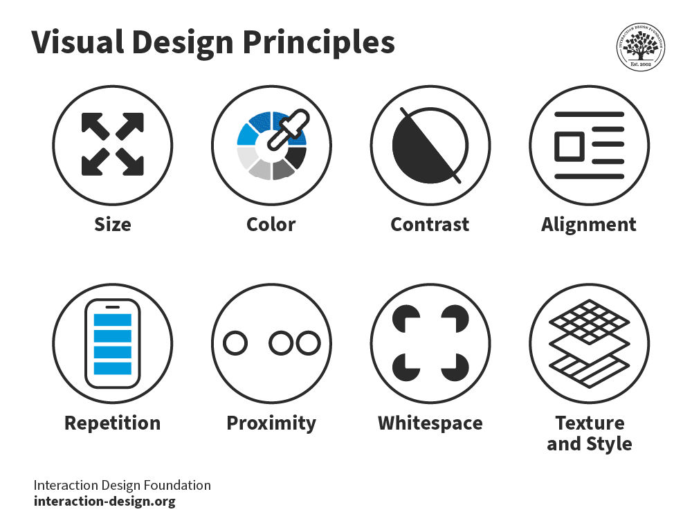
In "Typography: Hierarchy and Navigation," Ina Saltz emphasizes the importance of visual hierarchy in media design, providing techniques to create clear levels of importance. Key types of visual hierarchy include size, color, contrast, alignment, and spacing. These elements guide readers' attention and enhance readability, ensuring effective communication. Saltz's practical advice helps designers establish a logical flow of information, making content visually organized and navigable. This perspective underscores that visual hierarchy is crucial in media design for directing viewer focus and improving the overall user experience.
The Interaction Design Foundation's article "Visual Hierarchy" emphasizes how visual hierarchy guides the viewer's eye to important elements, enhancing user experience. Key types include contrast, size, alignment, and spacing, which create a clear visual structure. These principles ensure that the design communicates its message efficiently and effectively. This perspective highlights the importance of organizing visual elements to guide attention and improve clarity, making it a vital aspect of media design. By applying these techniques, designers can create visually appealing and functional designs that effectively convey their intended messages.
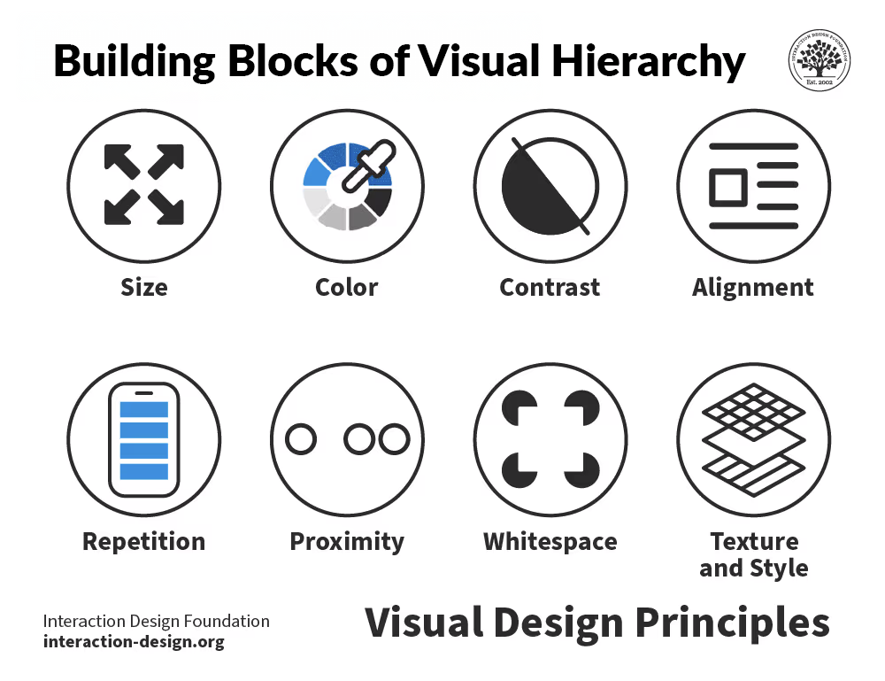
The image "Building Blocks of Visual Hierarchy" demonstrates types of visual hierarchy by effectively using size, color, contrast, alignment, and spacing to guide viewers' attention. This aligns with Ina Saltz's emphasis on creating clear levels of importance and enhancing readability and the Interaction Design Foundation's focus on organizing visual elements for clear communication. The image shows how strategically using these principles can create a visually organized and navigable design, ensuring the most important information gets communicated efficiently and effectively, enhancing the overall user experience.
-
Argo, B. (2023). Part 1: Design Reasoning. (2023). Full Sail Online. Retrieved from https://online.fullsail.edu/class_sections/222076/modules/811879/activities/4662602
Argo, B. (2023). Part 2: Typographic Refinement. (2023). Full Sail Online. Retrieved from https://online.fullsail.edu/class_sections/222076/modules/811879/activities/4662602
Butler, J. (2014, November 3). The 33 laws of typography [Video]. LinkedIn Learning. https://www.linkedin.com/learning/the-33-laws-of-typography/introduction?resume=false&u=50813145
Design Reasoning In Action Case Study. (2024). Full Sail Online. Retrieved from https://online.fullsail.edu/class_sections/222076/modules/811879/activities/4662604
Interaction Design Foundation. (n.d.). Design thinking non-linear process. InteractionDesign Foundation. Retrieved from https://public-images.interaction-design.org/tags/td-design-thinking-non-linear-process.png
Interaction Design Foundation. (n.d.). Visual design principles. Interaction Design Foundation. Retrieved from https://public-images.interaction-design.org/tags/td-visual%20hierarchy-visual%20design%20principles.png
Interaction Design Foundation. (n.d.). Visual hierarchy. Interaction Design Foundation. https://www.interaction-design.org/literature/topics/visual-hierarchy
Micozzi, M. G. (n.d.). Art vs. design infographic. MG Micozzi Design Blog. Retrieved from https://mgminicozzi.wordpress.com/art-vs-design-infographic/
Saltz, I. (2013, November 25). Typography: Hierarchy and Navigation [Video]. LinkedIn Learning. https://www.linkedin.com/learning/typography-hierarchy-and-navigation/welcome?u=50813145
Selis, K. (2022, March 24). Design vs. art: Objectivity & subjectivity. 116 & West. https://116andwest.com/strategic-insights/design-vs-art-objectivity-subjectivity/
Suhad M. (2016, September 22). The difference between design and art. UX Planet. https://uxplanet.org/the-difference-between-design-and-art-d9b293360ed2
2.5 Design Challenge:
Color, Forms, & Images
The Challenge
This exercise was all about color, forms, and images — how to communicate with imagery only and through their aesthetics, achieve tone, hierarchy, and contrast while communicating that chosen holiday.
If you remember from last week, we were given the following list:
New Year's Day | Valentine's Day | St. Patrick's Day | Earth Day | Easter | Juneteenth | Halloween | Dia de los Muertos | Thanksgiving | Kwanzaa | Hanukkah | Christmas
The three holidays that I picked are in BOLD RED text. The idea was to select and combine images and add color and shapes to communicate the events that we picked without using or showing any font or type … IMAGES ONLY. Deliverables were three images per holiday, with a total of nine images.
The Guidelines
1) Determine what type of event it will be from the list below:
film festival / maker fair / carnival / fund raising meal / concert / art exhibit / holiday specific activity (clean-up day, candy-making seminar, gift wrapping day, egg hunt, etc...)
2) Determine a basic target audience (demographic / psychographic)
Demographic examples: Age / income level / location Psychographic examples: people who are charitable by nature, are sociable, want to improve their community, want meaningful connections, looking for a unique experience, want to learn, etc...
Dia de los Muertos


Halloween


Valentine’s Day


My observations
This was a pretty good project. The idea was to communicate the holiday that is represented using only imagery. I think I did a good job nailing the tone of each holiday and representing specific events, but without any type or text, I felt that the messages didn’t quite hit the mark. It would be an interesting exercise to take existing ads or event graphics and try to recreate them with different images and no text and see how close you could get to the same message.