MDM525 Week 1
1.7 Mastery Journal
VISION
What are MY life’s aspirations
as a designer?
I will create a Production/Publishing Company through my creative efforts and the efforts of a collection of content creators within my family and close associates.
What do I value?
Family and My Imagination/Creativity
What are my talents?
Visual Storyteller, Artist, Animator, Filmmaker, and Teacher.
At the end of my life, what do I
hope to have accomplished?
I want to build an organization that allows me the means to create any story or any content that I am passionate about without compromising my ideas and values to appease some third party that may or may not share my ideals.
VALUES
Paul Rand
1. Creativity
2. Community
3. Originality
Saul Bass
1. Originality
2. Dependability
3. Innovation
Drew Struzan
1. Kindness
2. Peace
3. Sincerity
My Values System
1. Creativity
2. Originality
3. Dependability
4. Kindness
5. Sincerity
Discovering my MISSION
Motivator 1 -
Why am I doing this?
To obtain the specialized knowledge and skills required to successfully establish and market my independent production and publishing company while increasing my credibility and networking opportunities.
Motivator 2 -
What will I accomplish as a result of
successfully completing this graduate
degree program?
Develop my brand and create the content necessary to promote and establish my brand in my local and national markets.
My Pillars
Personal:
I want to be known for my integrity and my honesty.
Professional:
I want to be known as highly creative and reliable.
Spiritual:
I have a good relationship with God, but I desire to have a great one, one in which my choices and actions are such that I would not be ashamed to do them in the presence of the Almighty.
Mission Statement
(A Mission Statement for my time as a student in the MDMFA program)
By the time I complete the MDMFA program, I will have cultivated a robust Professional Learning Network and established key connections in my field of interest. These relationships will provide the resources and support necessary to publish and produce my first major projects within a year of graduation.
Design Challenges
Required Challenge
In this challenge, we reconstructed one of Alexander Girard's prints as a vector file using Adobe Illustrator. The face of the Sun and a few triangles were already done (left image), and we were instructed to trace over a raster dashed line drawing of the completed project. Once the image was complete, we were instructed to hide the template layer, rename the file, save a PNG, and then save the Illustrator file.
Optional Challenge 1
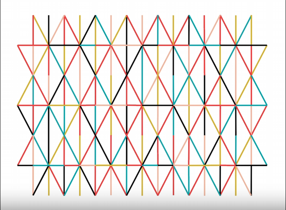
For this challenge, we completed a vector file of an iconic Alexander Girard grid pattern by drawing colored lines over a template using the Line Segment tool.
The Problem
This turned out to be a little more complicated than expected due to my color blindness. The file provided had an image of a tray with this line pattern and the colors with their RGB values (see image below). All we had to do was take the “eye dropper” and click on the color boxes. That changed the line weight and the color to the appropriate settings. That was very helpful, but the issue I had was telling the difference between the “red” and “black” lines on the image at the bottom of the reference provided.
The above image is a screen capture of the file that we started with; the little image on the left was our guide. Due to its compressed nature, I had a difficult time differentiating between the Red and Black lines.
The Solution
The video associated with this Design Challenge had a image of what the finished file should look like so I just paused the video, took a screen grab of it and pulled it into Photoshop. The image by it self is much better than the little compressed version in the file above but to avoid the headache of staring too long I decided to separate them.
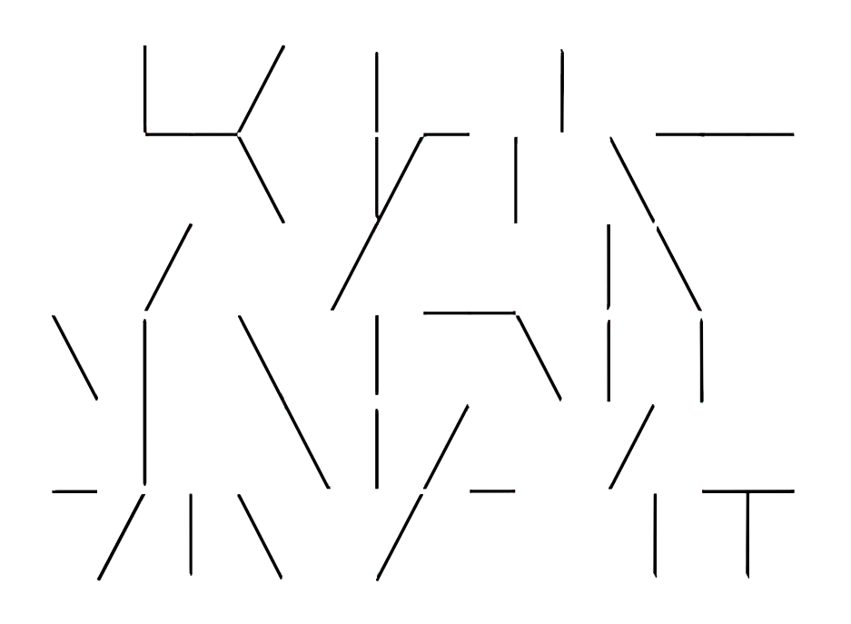
In Photoshop I just selected the color I wanted to separate with my handy dandy eyedropper tool, in the Top Bar Pulldown Menu go to “Select> Select Similar” and it selects all of that color. “Right-click on the screen” and “Copy to Layer” and you get the image below. Rinse and repeat and you have separate “Black” and “Red Images”.
This made it clear cut so the rest was just going through the pattern on the template, one color at a time and mapping it all out. Below is the final image.
Optional Challenge 2
(incomplete)
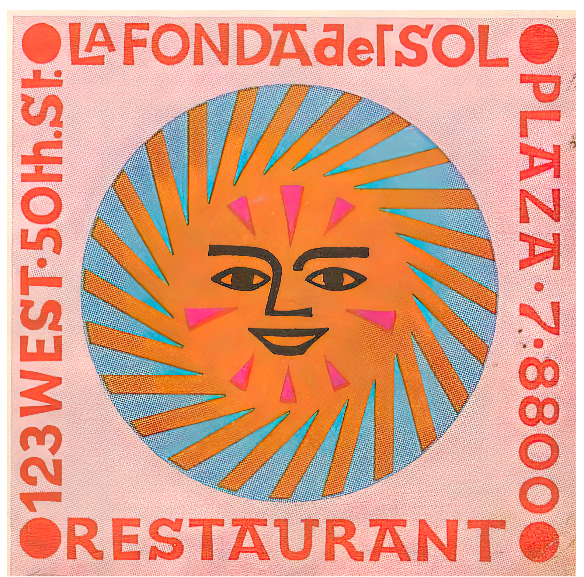
Well, I was looking forward to this one, but unfortunately, the clock ran out, and I had to submit what I had. For the exercise, the assignment was similar to the “DCOptional_1” assignment. There was a clean reference image with color swatches, and the adjacent image was an enlarged version of the artwork. We were supposed to build the image over the embedded jpeg.
I usually try to start with the most complicated part first and get it out of the way. I cut out one of the suns that had all of the text around the boarder of the box. The goal was to build all of the lines of text over the top of the image. Once I completed a line of text, I rotated the image to put another line of text at the top, moved the whole image down below the previously built line of text and then I started to create the next line. I have done this type of thing, plenty of times before and one of the most efficient ways to do this is to find a font that is close to this one and start with an existing letter, place and size it and then right click and “create outlines”. Once you have a close approximation to that letter, you move points around and add or subtract points as you need to until you have the letter, then “Rinse and Repeat”.
The text turned out pretty good, but next week I will try to manage it a little better so I have enough time to finish all of the required and optional assignments.


